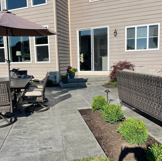
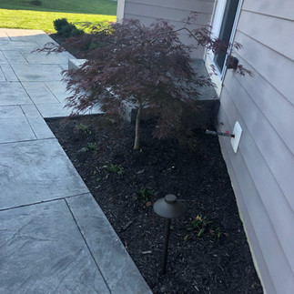
Sometimes when I sit down to start a design I find myself going a completely different direction then I originally expected. This project was one of those. The home owners wanted something different and I wanted to design something completely one of a kind.
Like a lot of newer homes in the Indianapolis region the rear side of the house doesn’t have a lot of architectural interest, and and can seem a little flat. Often simple square or rectangle patios are installed really close to the house as well, and it just accents how horizontal and flush everything feels.
For a while I had been designing patios on 45 degree angles to help add interested and depth to the existing home, but this time I did something a little different and settled on a 30/15 degree angle from the house. Using this angle was a little new to me and as the vision of the space began to develop in my mind I loved how it looked when someone opened the sliding back door and saw how the view of the patio and backyard would just open up.
The home owners also wanted to two distinct areas in the layout- one for a 6 person table and chairs, and a second area for a fire pit and a cedar panel for privacy. As the design continued to develop I was able to create these two spaces by separating them with a row of boxwood.
As I stared as the patio layout I still felt like something was missing, but I just con’t put my finger on it so I decided to walk away from the project and to work on it again the next day. Often when I’m stuck I find the best move is to call it a day spent time with my family.
The next day, with a fresh mind, I started on the design again. I opened up my laptop and stared at the layout. The two patio spaces were uneven and when I tried to make them more symmetrical it just looked off. I keep playing with it- moving one line here and another line here. But still nothing looked right. After an hour I erased all that day’s changes and went back to look at the uneven patio layout again.
Something about that particular layout looked correct, but it wasn’t refined enough. I decided to lean in to it’s asymmetrical nature and made the 2 patio spaces more distinct. Then I focused on the steps and pulled the treads off center from each other so they were also asymmetrical. Now it was getting exciting!
THE LOCATION
THE DESIGN
THE FINAL


Comments